


IF ATTENTION IS RENTED,
AND RITUALS ARE EARNED,
WHAT SHOULD BRANDS REALLY AIM FOR?

That was the provocation Vy, our Graphic Designer, used to kick off her <Donut Session>
To explore the theme, Vy unpacked three iconic campaigns that prove advertising can move beyond fleeting impressions to create lasting rituals, and ultimately, shape (sub)culture.
Here’s where the conversation took us.
1. Spotify Wrapped
Agency: Spotify In-house Creative Team (since 2016)
Awards: Cannes Lions, D&AD, ADC Awards
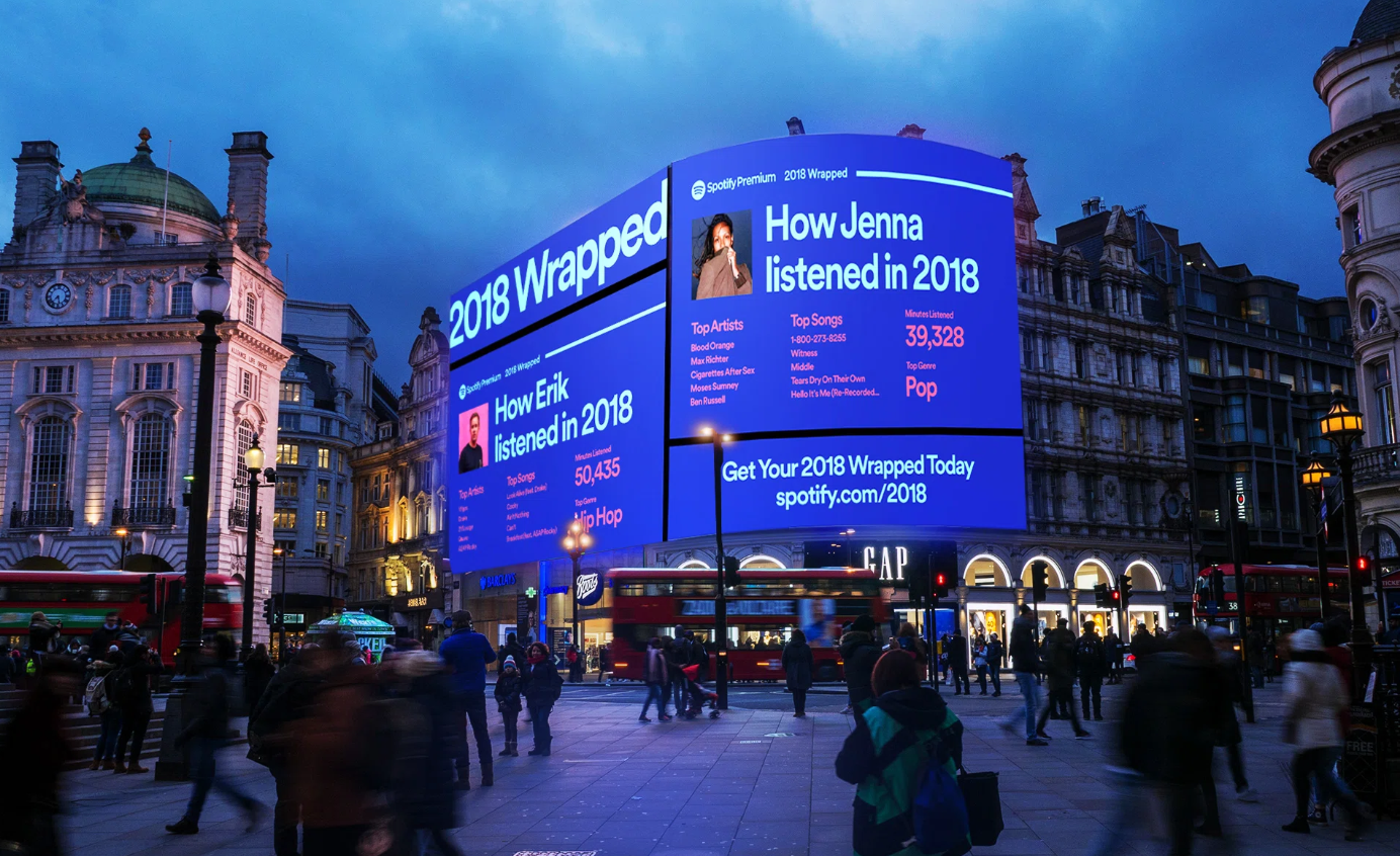
Spotify proved that data is also powerful when it’s humanized.


Vy: “Everyone knows Spotify as the app you open for music. But once a year, everyone opens it at the same time for Spotify Wrapped. It becomes a trend, an end-of-year ritual that people wait for, share, compare and quietly judge everyone’s taste including their own.”

Nick:“So why did this one work, when so many data-driven campaigns didn’t?”


Thu: “Funny thing is, Wrapped flopped twice before it became a popular ritual. It only exploded when the team traded boring charts for that ‘ugly-cool’ neon gradient. And personalization - people don’t share music; they share themselves. That’s why we have Wrapped in 9:16 format so people could share it on their Instagram Stories.”
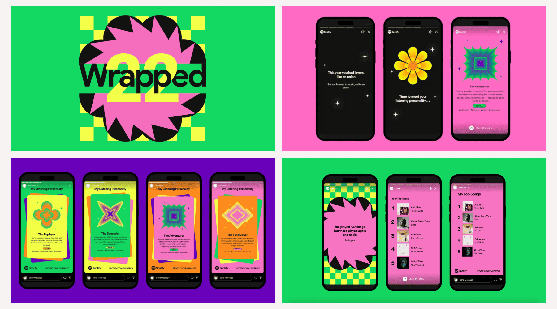
Nick: "The magic here is treating data as narrative, not just numbers. It taps into music's real superpower: anchoring memories. Your 'Year in Music' is actually a journal of your year in life. And it solves a massive business problem - retention - with pure emotion. Users stay because they're invested in their own story.
The room went quiet. One of those “what ifs” that we hope might just turn into a brief a client says yes to.



THE TAKEAWAY
Data isn’t the Goal. A Personal Narrative is.
At NguyenGordon, this is our North Star for digital and social media marketing in Vietnam. We translate cold analytics into experiences that people actively anticipate. Through content marketing, graphic design, and high-impact advertising, we move beyond the "scroll" to create something lasting.
2. Coca-Cola Christmas 1995
Campaign: Holidays Are Coming
Awards: Multiple Cannes Lions
Status: One of the most iconic long-term brand platforms
This is where Coca-Cola owns Christmas.


Vy: “I picked the 1995 version. Before AI. Before everything. The first time the signature Coca-Cola red trucks rolled in. After that, people didn’t just watch the Coke Christmas ads, they waited for them. What I like about this ad is that it was selling a feeling.”

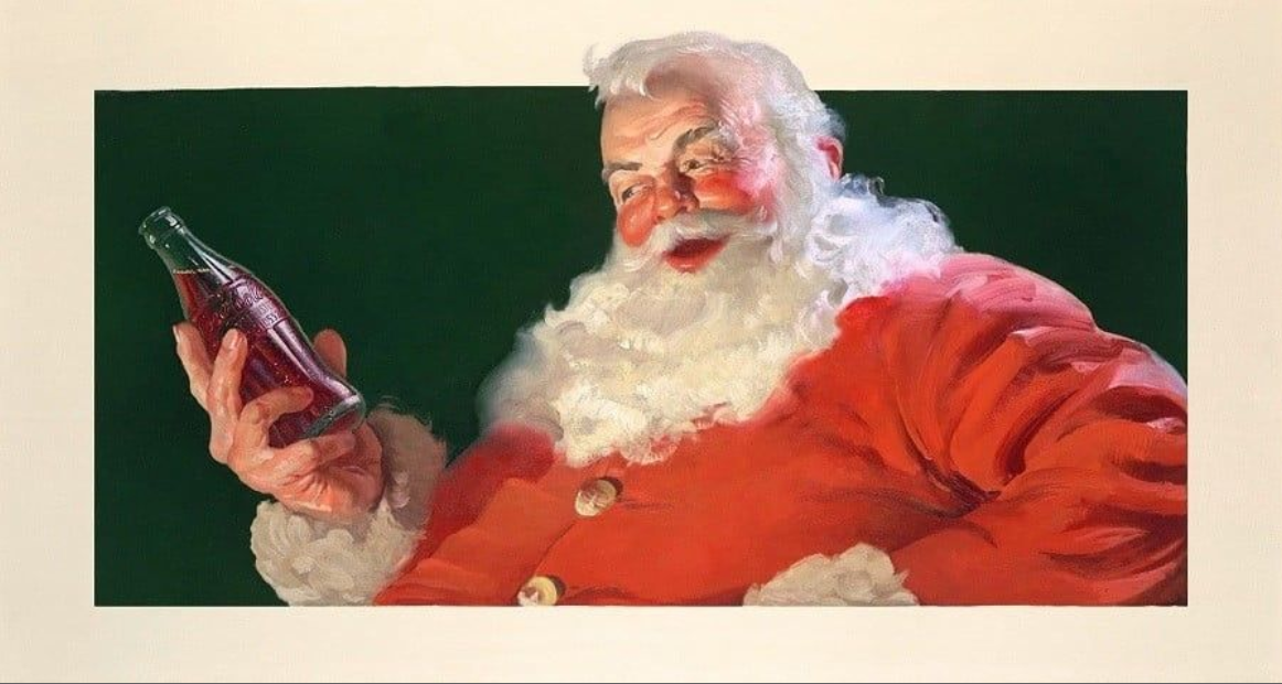

Nick: “But isn’t that a little egotistic? A red Coke truck rolls in, claims the holiday, and suddenly everyone’s happy to see… Coca-Cola?”
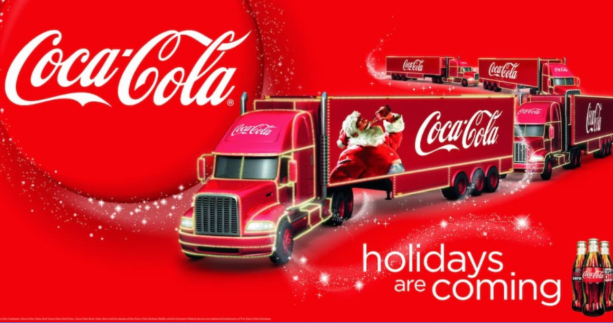

VA: “It worked because of the alignment. Red already belonged to Christmas; Coke just had the vision to own that space properly.”

Phuong: “It’s the same in Vietnam. People choose Coke for Tết gifts because red is the color of luck. That association is permanent.”

Nick: “That’s the power of the long game. Besides the color red, their ads always include their promise: ‘Happiness’. They just kept showing up with the patience to make it stick and eventually, it became a ritual.”
THE TAKEAWAY
Brands earn cultural ownership when they stay true to a single promise. At NguyenGordon, we believe strong brands are built when we are given the time to understand the business, not just the brief.
Rituals are built on consistency.
3.Campaign: Đi Để Trở Về #1
Awards: Spikes Asia, YouTube Ads Leaderboard VN, PR Asia Awards
The trendsetter for music video-style Tết ads.
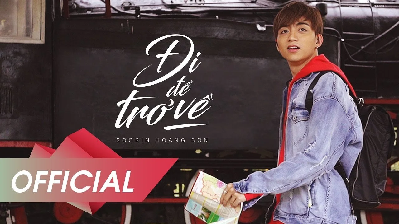
Vy: “Tết ads are the ultimate marketing ritual in Vietnam. Every brand fights to own a moment. But Biti’s did something different. Instead of the cliché ‘come home’, they told young people to go away, travel far so they could truly appreciate returning. And they didn't make a TVC; instead, they dropped a Music Video. It hit so hard in 2017 that ‘Tết MVs’ became the industry standard.”

Thu: “Because it validated the audience. It connected the product - sneakers - to the physical and emotional journey of a year well-spent. An MV touches the soul in a way a standard hero film just can’t.”
Nick: “It shifted the whole landscape. But why did that specific insight work so well?”

Nick: “Exactly. I bet the team asked a hundred ‘What ifs’ to turn a standard brief into a cultural movement. That’s the goal: you have to keep pushing the idea as far as the timeline allows.”
Here we go. Another ‘WHAT IF’
THE TAKEAWAY
Insights are the Anchor.
Execution is the Sail.
A powerful insight is what we strive for, especially during high-stakes seasons like Tết, where brands are shouting over each other, but very few are actually saying anything meaningful.
At NguyenGordon, this philosophy is the foundation of our approach to branding and cultural marketing for our local and international clients.We look for the tension beneath the surface to create campaigns that resonate.

A CASE STUDY WE HAVE A LOT OF FUN BUILDING
CLIENT: BVIS
A prime example is our work for BVIS. We uncovered a real cultural tension: families embracing international education while fearing their children might lose touch with their roots.
So we created a gentle story that parents and children could share, following Lúa, a young heron proud of being “global,” yet lost at home. We brought it to life on stage, performed by children for their parents. An event at first, it grew into a shared moment, a memory, a ritual.
This is the power of culture-driven marketing in Vietnam. Whether working with startups, SMEs, or global brands, we believe meaningful branding is built through care, consistency, and deep cultural relevance.