
SIMPLE AND EFFECTIVE DESIGN FOR SIMPLE AND EFFECTIVE PRODUCT
STANK BRANDING AND ON-GOING
A cheaper version of Vitalize, we also undertook all branding, naming and on and offline collateral design for our client in USA. After successful launch, we are now responsible for all on-going communications.
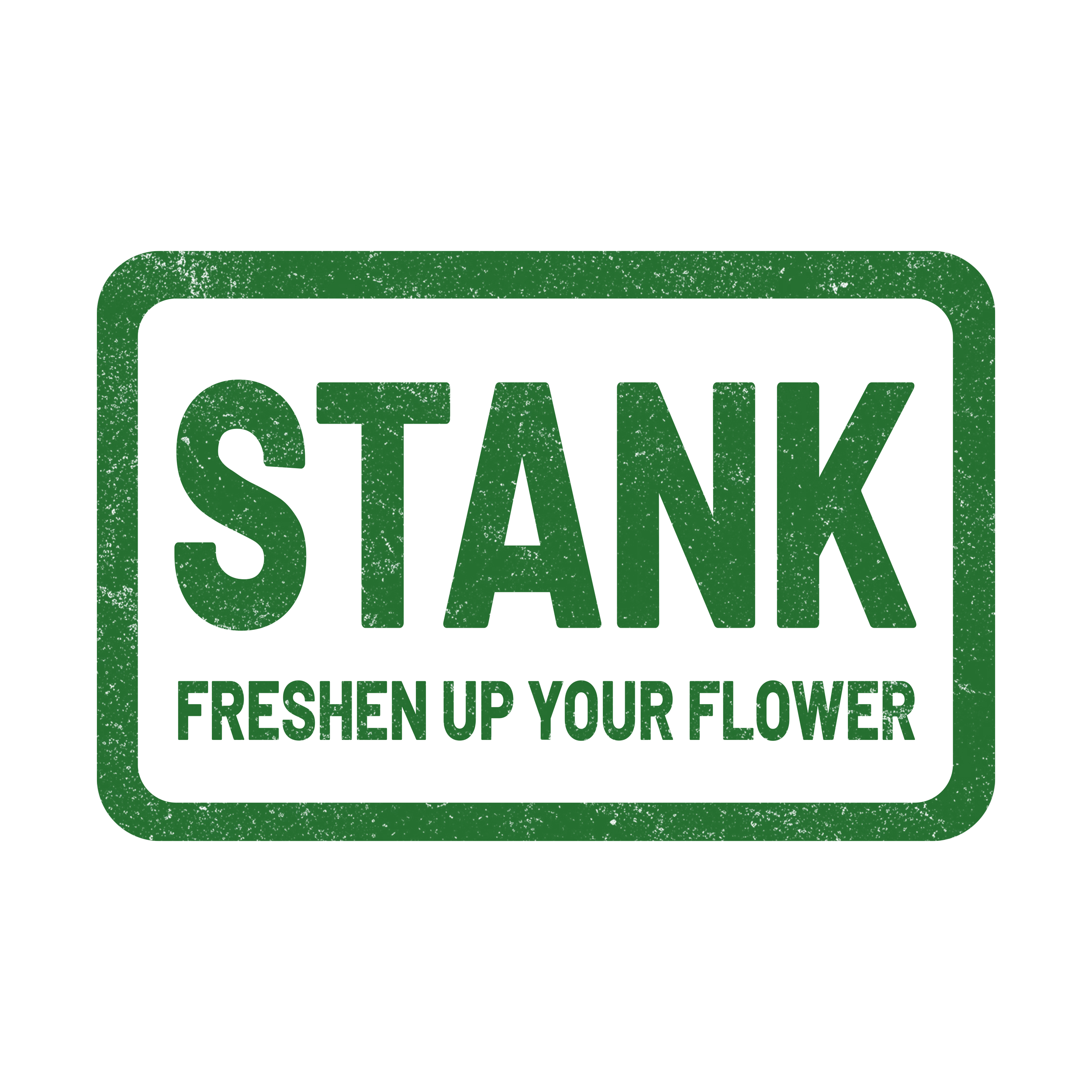
Logo
The logo reads like a stamp. The texture adds just enough grit to avoid looking clean or premium. It’s meant to feel mass-made and cost-effective.
“Freshen up your flower” sits under it like a line you’d see on a label, not a tagline trying to sell something. It states the use and moves on.
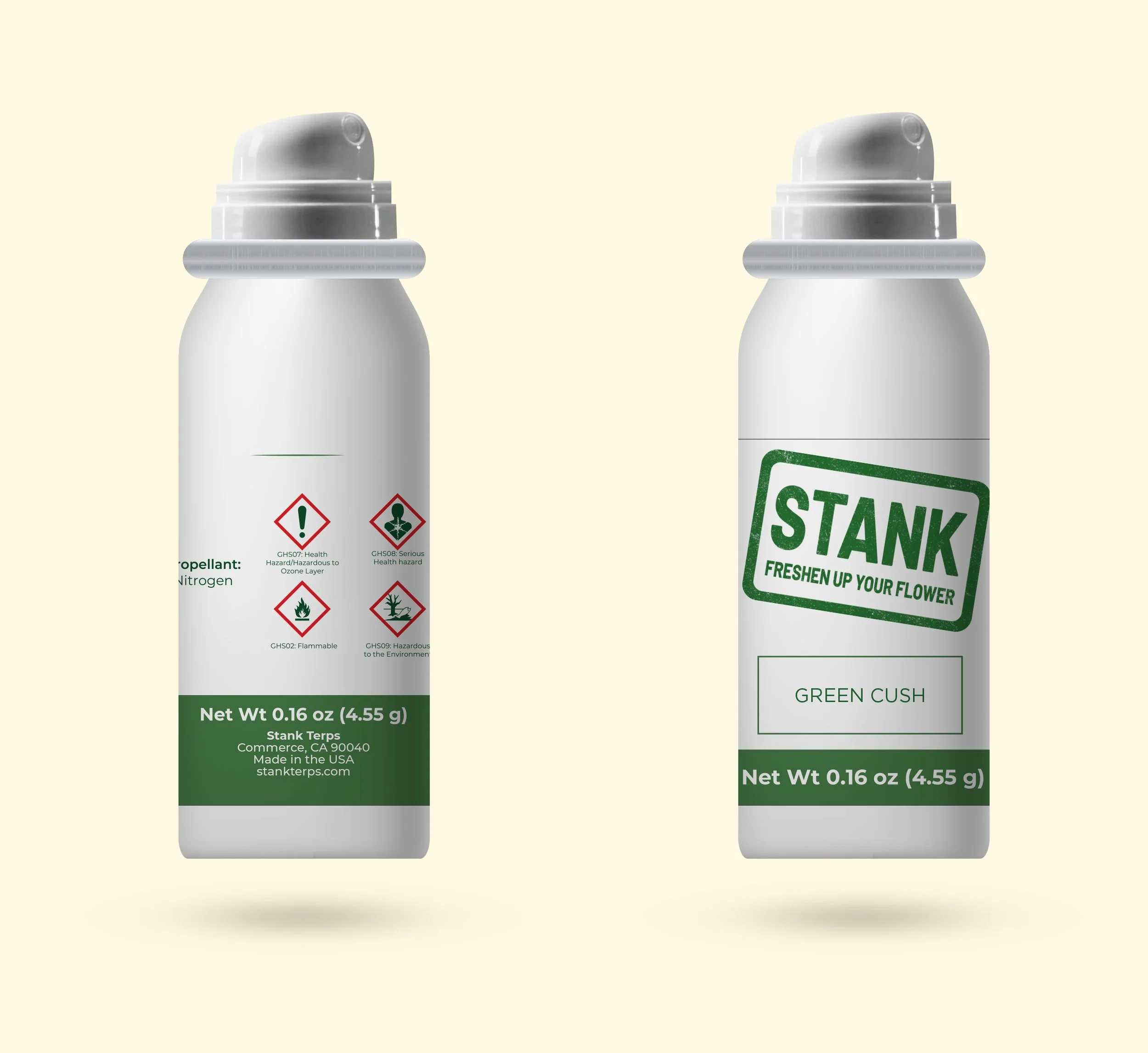
Packaging design
The can follows the same idea. Clear hierarchy, no decoration. The logo is the hero, placed large and slightly angled so it catches the eye on shelf. Everything else supports it.
Flavor names are straightforward. No storytelling, no mood-setting. Just a label so you can pick and go.
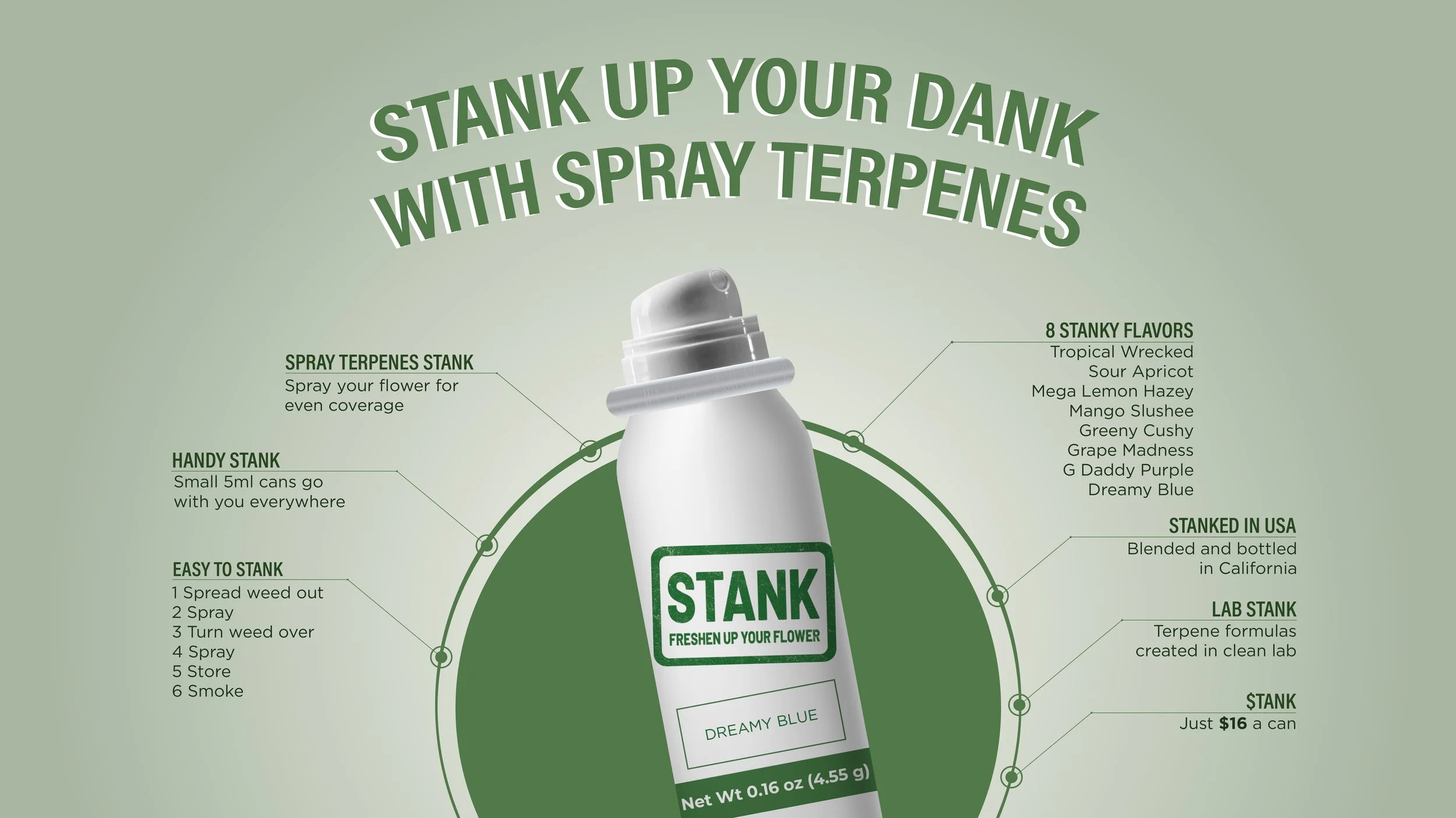
Website
The website mirrors the product. It opens with the can, the name, and the purpose. No long intro. Sections are short. Instructions are broken into simple steps. Flavors are listed, not described. Pricing is clear. Navigation is minimal.
Everything points to the same idea: keep it simple, keep it obvious, keep it cheap without looking careless. Stank doesn’t try to compete on “fluff”. It competes on clarity.