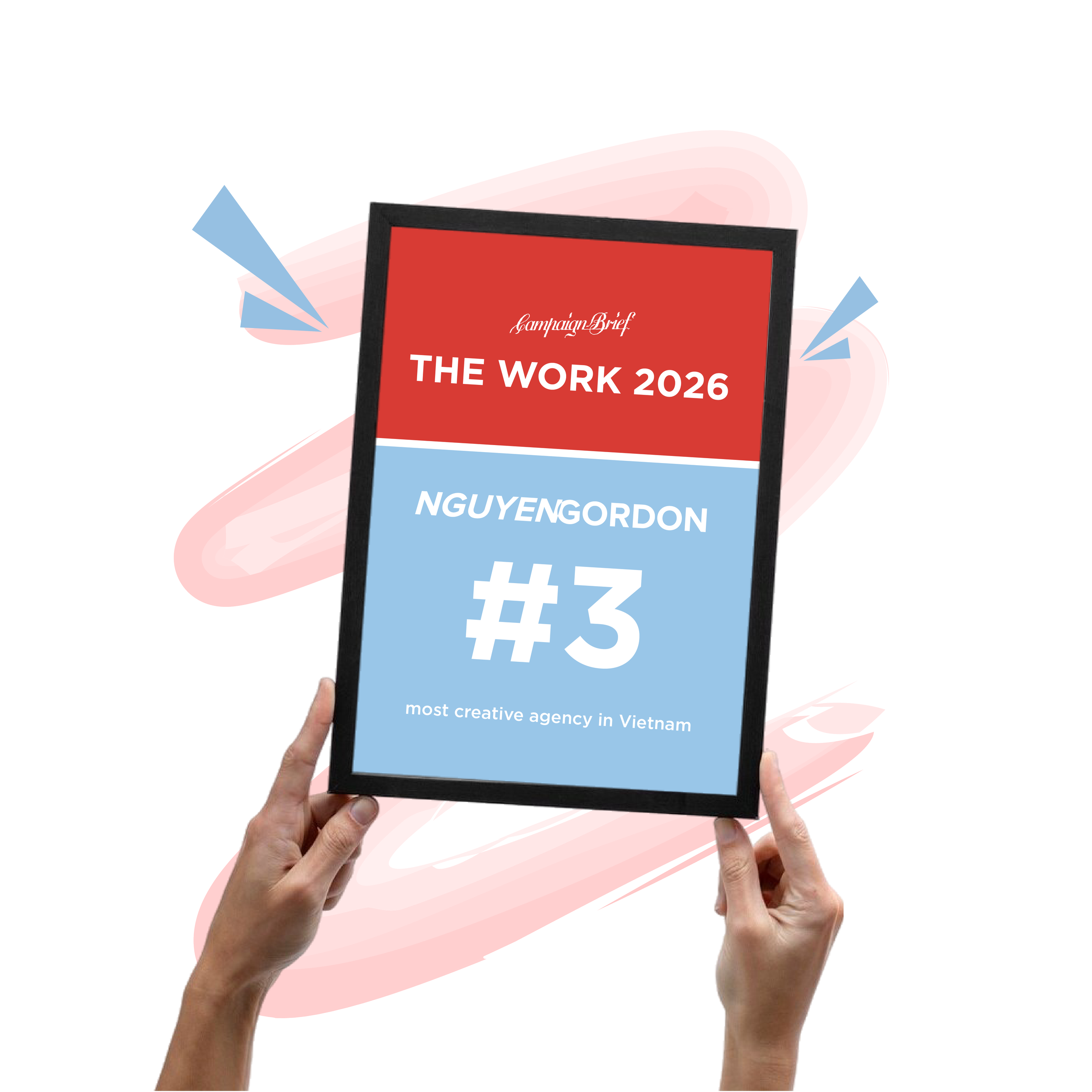
Hands holding a tablet displaying a red banner with white text that reads 'Campaign Brief THE WORK 2026 NGUYEN GORDON' and smaller text underneath, set against a pink abstract background with arrows.
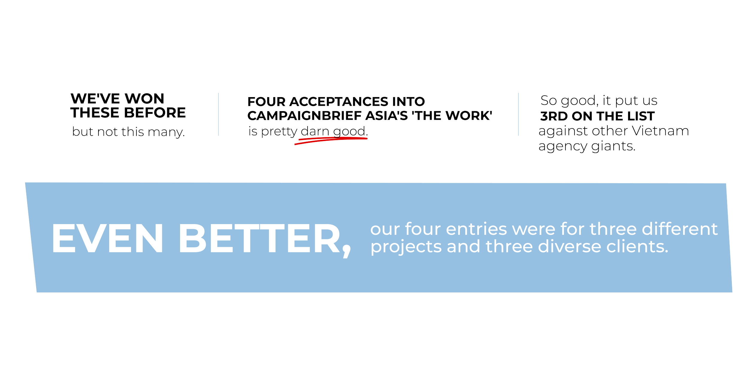
Infographic with text and graphics about success and achievements, featuring sections with quotes and statistics.

3rd MOST CREATIVE AGENCY IN VIETNAM

O1

LOCAL INSIGHT & CULTURE

XIN CHÀO
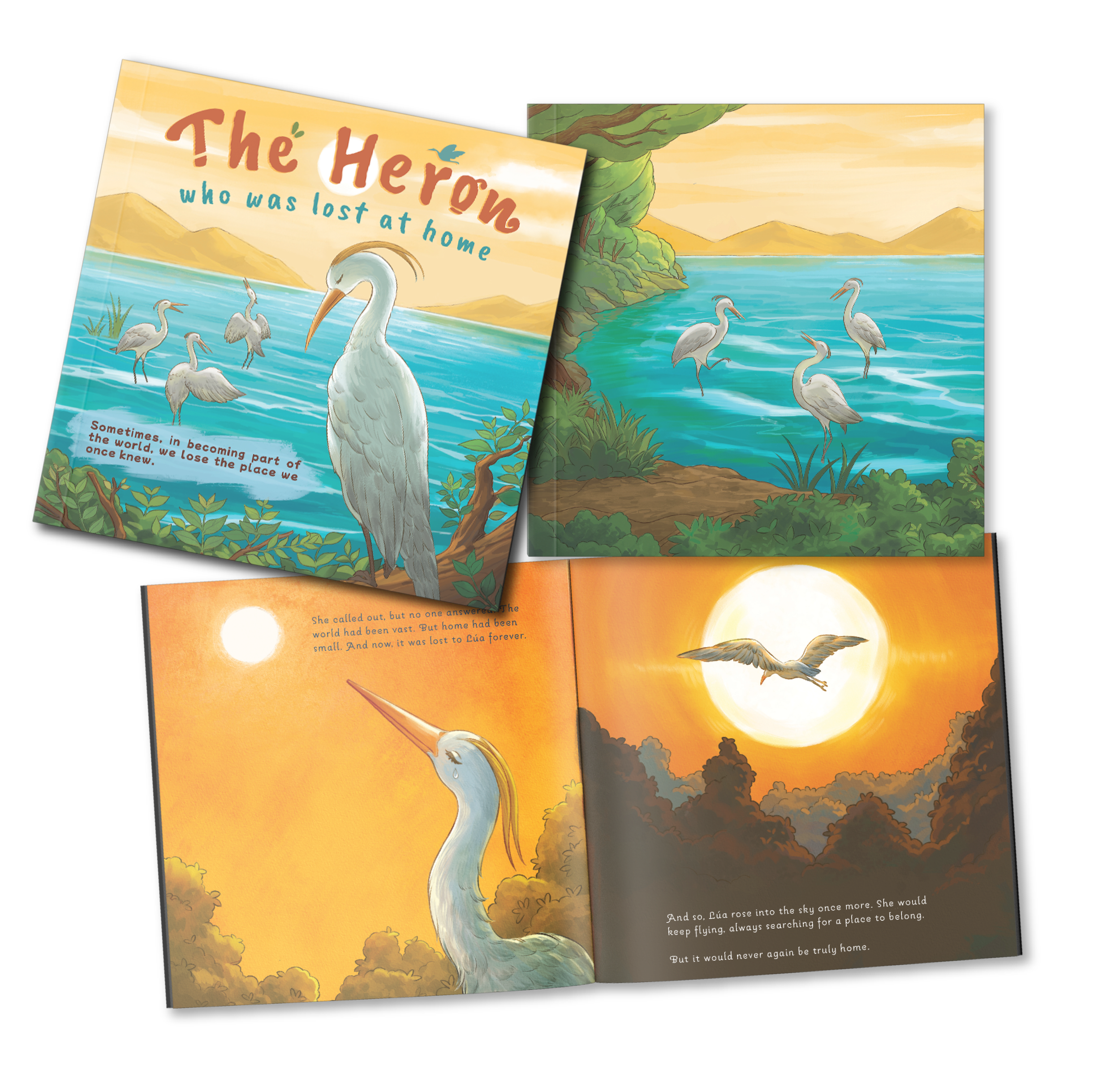
Open children's book titled 'The Heron who was lost at home' showing a heron in a lake surrounded by trees, with a mountain and sunset in the background.

First up, Nord Anglia Group and their British Vietnamese International School. Called "The Heron Who Was Lost At Home", this pitch-winning work reimagined the typical school brochure. Instead of same-same stats and happy-kids pics, we told a story - a fable that revealed deeper concerns parents should be wary of when selecting a school for their children's future.

In the style of a children's book, we follow Lúa, a curious young heron whose parents dream of giving her opportunities beyond the river. To fulfill their wishes, she soars across oceans and forests, discovering new worlds and becoming a bird of the world. But when she returns, home no longer feels like home.
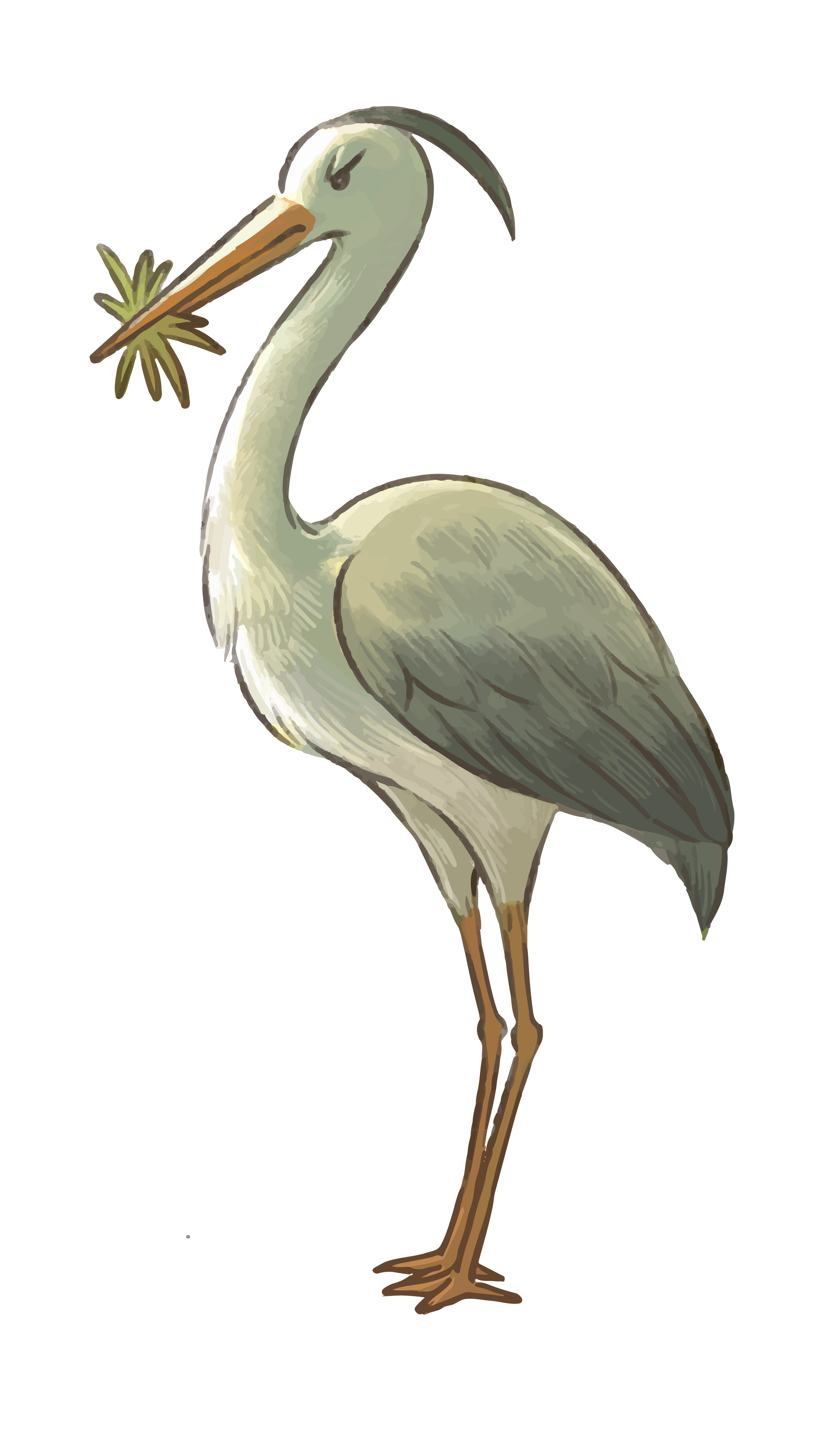
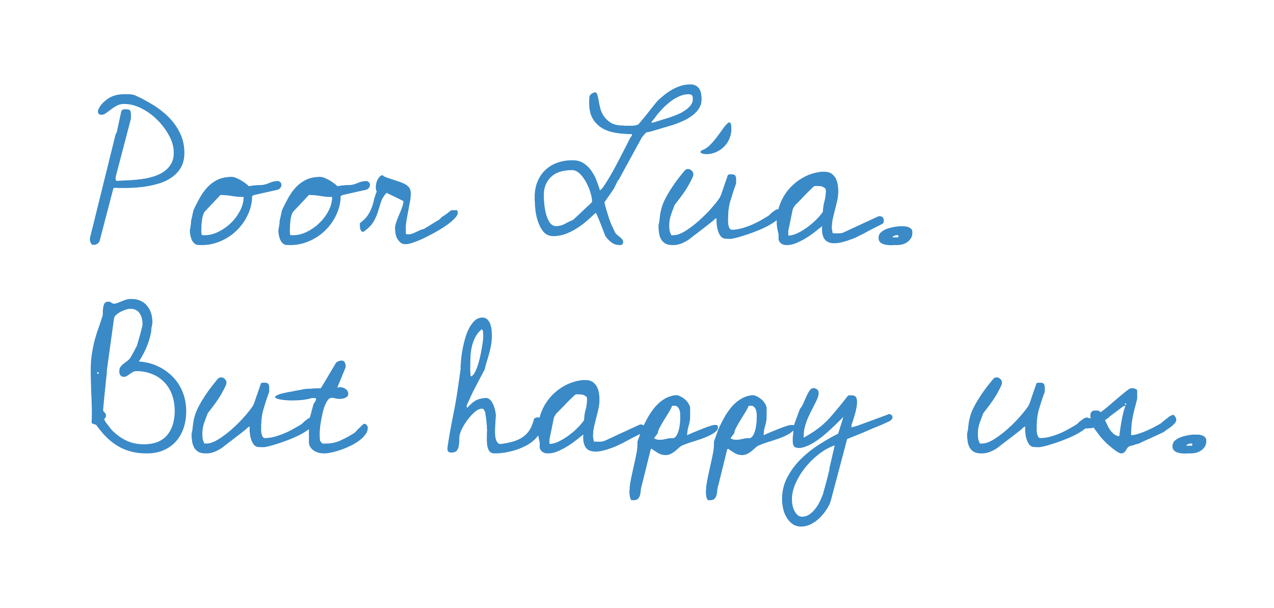
Illustration of a heron holding a small branch in its beak, standing on one leg, with a neutral background.
Text that reads 'Pour Lía, but happy us' in blue cursive font on a black background.

O2

ILLUSTRATION

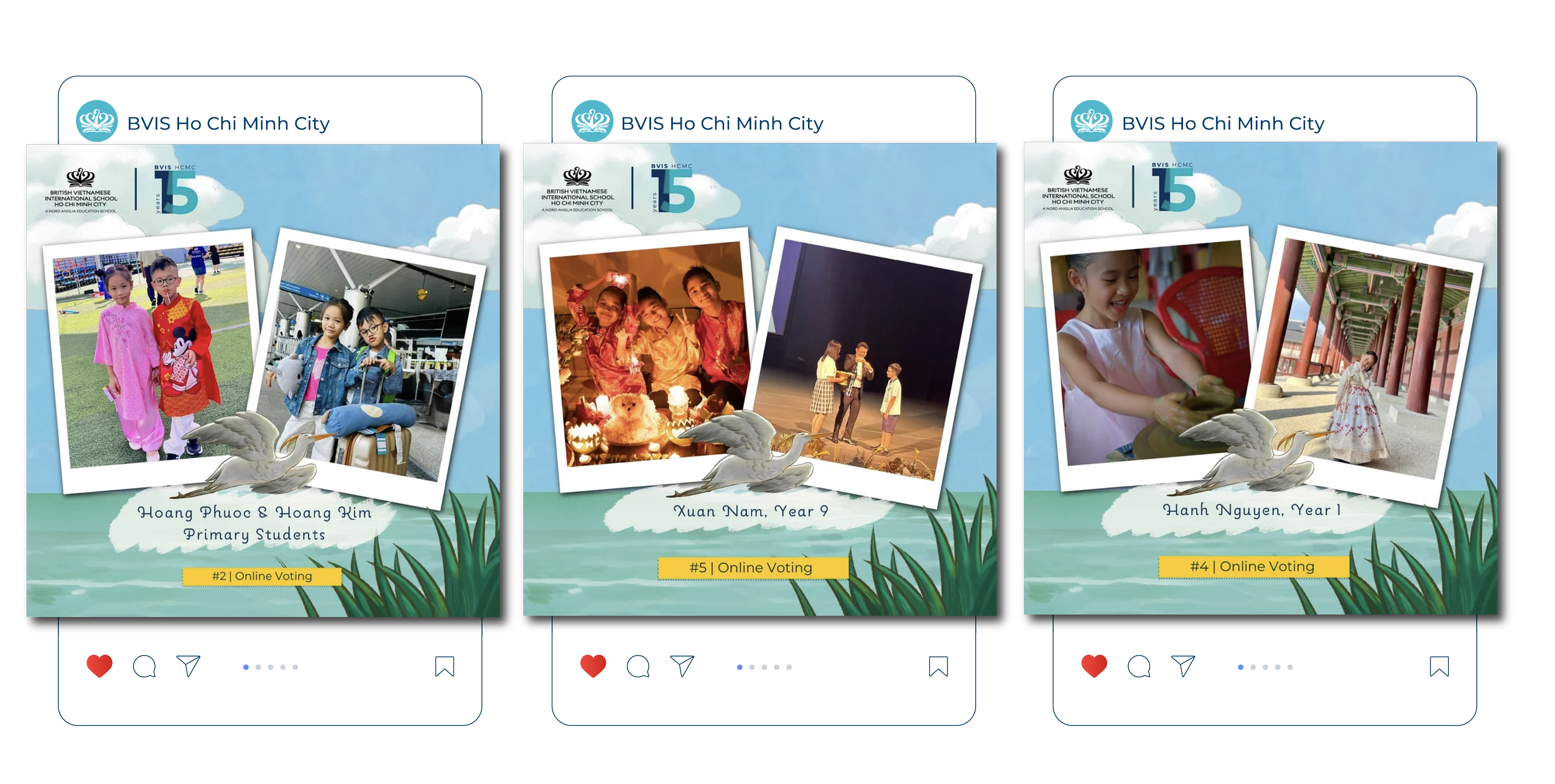
She grew beyond the book into a performance at the school and a social media campaign with UGC that actually worked!

Digital illustration of a pink pill or capsule with a shiny surface, set against a black background.
Three posters celebrating the 15th anniversary of British Vietnamese International School Ho Chi Minh City, featuring photos of students and activities, with event details and online voting hashtags.
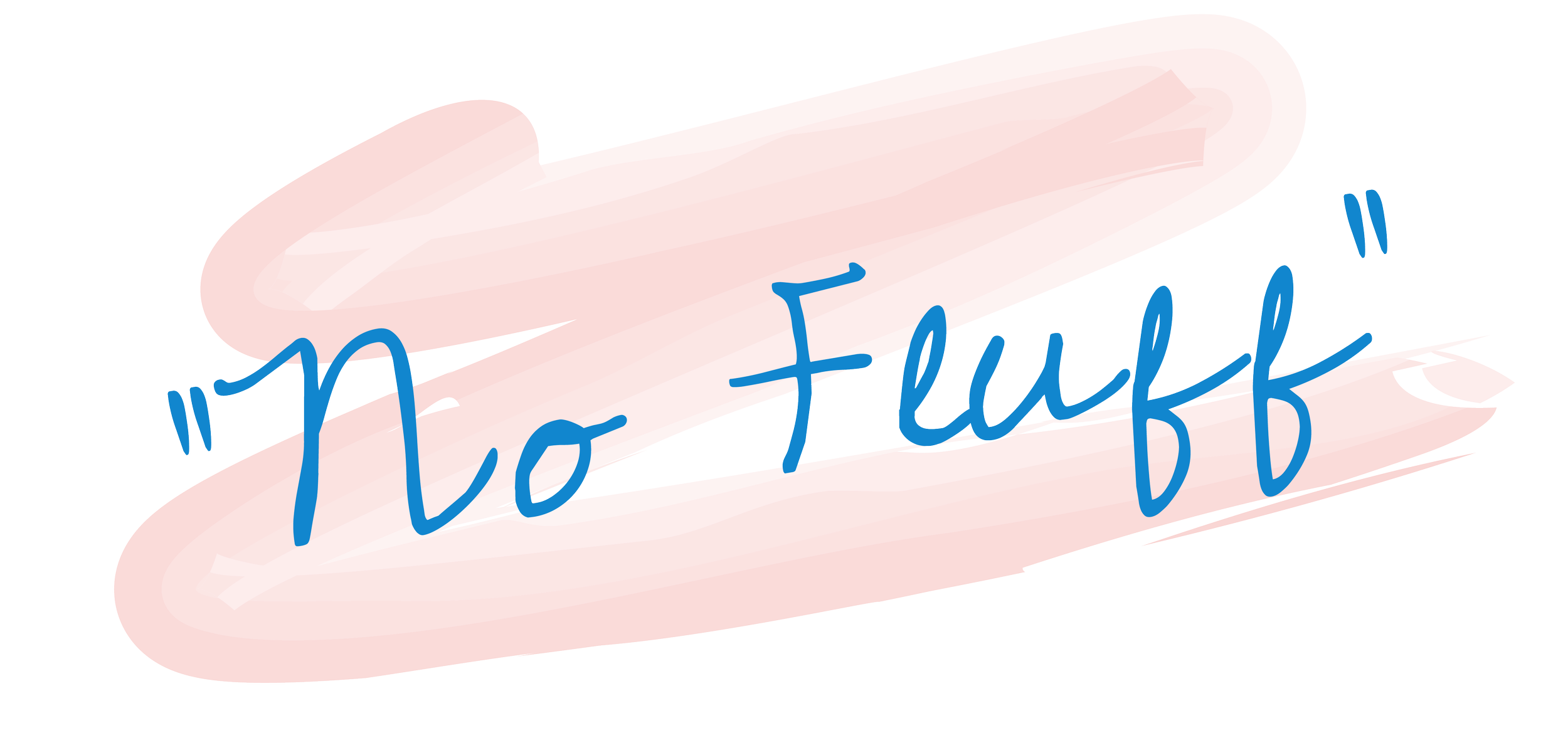
Pink brushstroke background with blue handwritten style text saying, 'No Fuff'.

O3

Business to Business (B2B)

Next, The Business Executive Network and "No Fluff". BEN, as it is affectionately known to us, is a top-level, C-Suite, invite-only networking group. As a member, you get access to no-nonsense, peer-to-peer sessions and advisories.

Our idea was adapted into print, posters and standees to remind existing members they're in the right place and tempt others into a networking membership that is fluff-free.
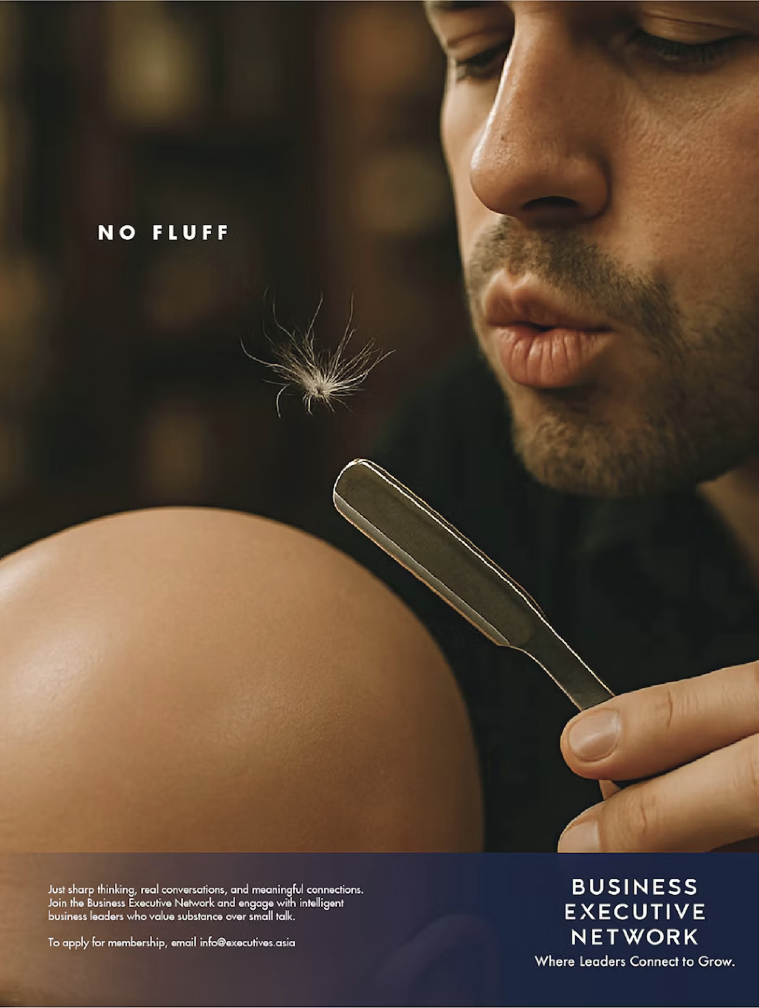
Close-up of a man with a beard and mustache holding a straight razor near his face, with a dandelion seed floating in the foreground. The background is blurred.

O2

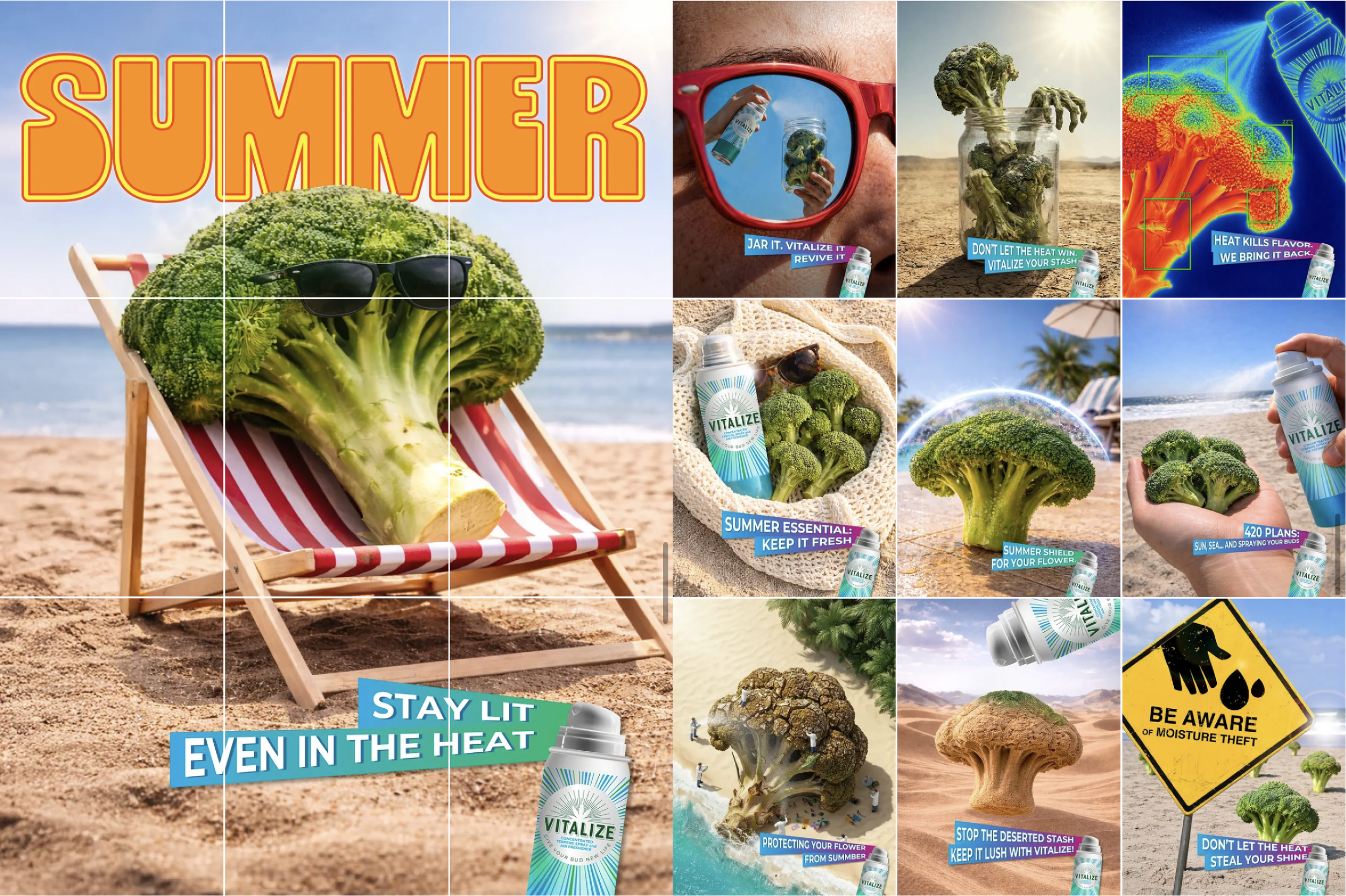
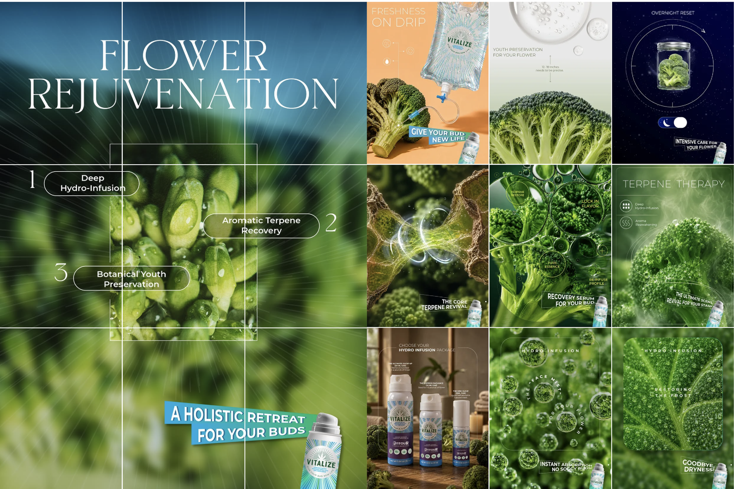
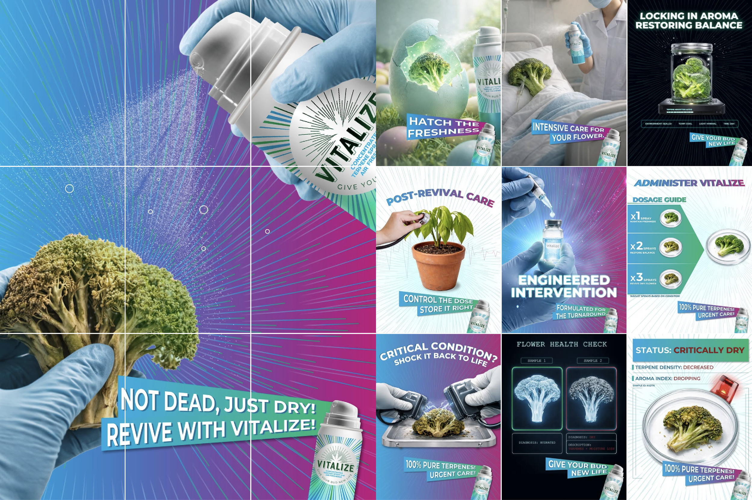
Last but not least, Vitalize - an aerosol terpenes product that brings aficionados' flower back to life, Based in California, this is a brand we helped develop from the ground up, from afar. No big deal, especially as the time difference puts us ahead of the client! Having created the name, logo, tagline and positioning, we also created social media posts across their channels. The most successful of which were these three campaigns "Spa", "Revival" and "Summer".

SOCIAL MEDIA CAMPAIGN
Text reading 'Happy birthday'. The word 'happy' is in capitalized black font, and 'birthday' is in lowercase blue cursive font.
A collage of images promoting broccoli and a supplement called Vitalize with summer themes. The main image features a broccoli on a beach chair wearing sunglasses with the word "SUMMER" in bold, orange letters. Other images show a person holding broccoli and spray, broccoli in jars and baskets, and various signs and graphics emphasizing health, summer, and protection.
A collage of images and text promoting flower rejuvenation products and techniques, including broccoli, hydro-infusions, terpenes, and preservation methods.

Campaign: Summer

A collage of images promoting Vitalize plant health supplements and their application for plants and flowers. The collage features bottles of Vitalize spray, a hand holding a plant, a woman spraying a flower in a hospital bed, and scientific diagrams of plant health diagnostics.

Campaign: Revival

Campaign: Spa

The phrase 'Always great' written in blue cursive text on a black background.

against some bigger, more established agencies in Vietnam.

TO COMPLETE

TO UPHOLD

judged by the most brilliant creative minds in the industry.

TO WIN

Sign that says 'Great work, get noticed!' in blue and red text with a pink background.

our high creative standards and belief that

A diagram showing a blue curved arrow pointing left and then upward, illustrating a change in direction.